扫码一下
查看教程更方便
Bootstrap 媒体对象在版本 5 中已经停止支持了。但是,我们仍然可以使用 flex 和 margin 创建包含左对齐或右对齐媒体对象(如图像或视频)以及文本内容(如博客评论、推文等)的布局 。
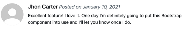
<div class="d-flex">
    <div class="flex-shrink-0">
        <img src="demo_source/avatar.svg" alt="Sample Image">
    </div>
    <div class="flex-grow-1 ms-3">
        <h5>Jhon Carter <small class="text-muted"><i>Posted on January 10, 2021</i></small></h5>
        <p>Excellent feature! I love it. One day I'm definitely going to put this Bootstrap component into use and I'll let you know once I do.</p>
    </div>
</div>
上面示例的输出如下所示:

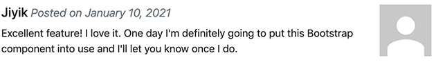
我们还可以创建媒体对象的其他变体。 将 .rounded 或 .rounded-circle 等图像修饰符类应用于图像来创建圆角或圆形图像。
<div class="d-flex">
    <div class="flex-shrink-0">
        <img src="demo_source/avatar.svg" class="rounded-circle" alt="Sample Image">
    </div>
    <div class="flex-grow-1 ms-3">
        <h5>Jhon Carter <small class="text-muted"><i>Posted on January 10, 2021</i></small></h5>
        <p>Excellent feature! I love it. One day I'm definitely going to put this Bootstrap component into use and I'll let you know once I do.</p>
    </div>
</div>
上面示例的输出如下所示:
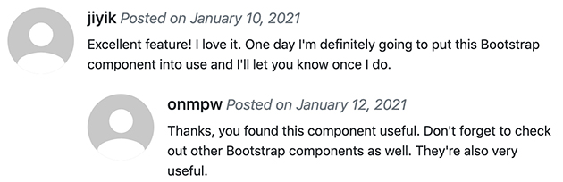
媒体对象也可以嵌套在其他媒体对象中。 让我们看一个例子:
<div class="d-flex">
    <div class="flex-shrink-0">
        <img src="demo_source/avatar.svg" class="rounded-circle" alt="Sample Image">
    </div>
    <div class="flex-grow-1 ms-3">
        <h5>jiyik <small class="text-muted"><i>Posted on January 10, 2021</i></small></h5>
        <p>Excellent feature! I love it. One day I'm definitely going to put this Bootstrap component into use and I'll let you know once I do.</p>

        <!-- Nested media object -->
        <div class="d-flex mt-4">
            <div class="flex-shrink-0">
                <img src="demo_source/avatar.svg" class="rounded-circle" alt="Sample Image">
            </div>
            <div class="flex-grow-1 ms-3">
                <h5>onmpw<small class="text-muted"><i>Posted on January 12, 2021</i></small></h5>
                <p>Thanks, you found this component useful. Don't forget to check out other Bootstrap components as well. They're also very useful.</p>
            </div>
        </div>
    </div>
</div>
上面示例显示的嵌套媒体对象如下所示:
我们还可以通过简单地调整 HTML 代码本身来更改内容以及媒体对象的水平对齐方式,如以下示例所示:
<div class="d-flex">
    <div class="flex-grow-1 me-3">
        <h5>Jiyik <small class="text-muted"><i>Posted on January 10, 2021</i></small></h5>
        <p>Excellent feature! I love it. One day I'm definitely going to put this Bootstrap component into use and I'll let you know once I do.</p>
    </div>
    <div class="flex-shrink-0">
        <img src="images/avatar.svg" alt="Sample Image">
    </div>
</div>
上面示例显示的结果如下
除此之外,我们还可以使用 flexbox 实用程序类在内容块的中间或底部对齐图像或其他媒体对象,例如,可以使用 .align-self-center 类进行垂直居中对齐,使用 .align-self-end 类用于底部对齐。
默认情况下,媒体对象内的媒体是顶部对齐的。 看下面的例子:
<div class="d-flex">
    <div class="flex-shrink-0">
        <img src="demo_source/avatar.svg" alt="Sample Image">
    </div>
    <div class="flex-grow-1 ms-3">
        <h5>顶部对齐媒体 <small class="text-muted"><i>- 这是默认情况</i></small></h5>
        <p>Lorem ipsum dolor sit amet, consectetur adipiscing elit...</p>
    </div>
</div>
<hr>