Python 绘制决策边界
使用图片、图表和绘图对结果进行可视化总结,使人的大脑可以更轻松地处理、理解和识别任何给定数据中的模式。 本文将逐步介绍使用 Matplotlib 的 pyplot 绘制决策边界的过程。
为此,我们将使用 Sklearn 库提供的内置预处理数据(无缺失数据或异常值)数据集包来绘制数据的决策边界。 然后我们将使用 Matplotlib 的库来绘制决策边界。
安装必备库
要使用 Matplotlib 的 pyplot 的绘图功能,我们首先需要安装 Matplotlib 的库。 我们可以通过执行以下命令来实现:
pip install matplotlib
确保我们使用正确的 Python 版本也很重要。 对于本文,我们使用的是版本 3.10.4。
我们可以通过执行以下命令来检查当前安装的python版本:
python --version
决策边界
分类机器学习算法学习将标签分配给输入示例(观察)。 分类的目标是分离特征空间,以便尽可能正确地将标签分配给特征空间中的点。
这种方法称为决策面或边界,它作为一种演示工具来可视化分类预测模型的结果。 我们可以为至少两个输入特征创建一个线性决策边界。
但是,如果有两个以上的输入特征,我们可以创建多线性决策边界。 本文将重点绘制两个输入特征的决策边界。
使用 Matplotlib 的 pyplot 绘制分隔 2 个类的决策边界
导入所需的库
import numpy as np
import pandas as pd
import matplotlib.pyplot as plt
from matplotlib.colors import ListedColormap
from sklearn import datasets
from sklearn.linear_model import LogisticRegression
from sklearn.preprocessing import StandardScaler
from sklearn.metrics import accuracy_score, confusion_matrix
from sklearn.model_selection import train_test_split
生成数据集
我们将使用数据集类中的 Sklearn 库 make_blobs() 函数生成自定义数据集。 如上所述,我们将使用的生成数据集是 Sklearn 库提供的内置预处理数据(无缺失数据或异常值)数据集包。
Our custom-generated dataset variables are as follows.

    samples     features    standard deviation
    1000        2           3

XFeature, yFeature = datasets.make_blobs(n_samples = 1000, centers = 2, n_features = 2, random_state = 1, cluster_std = 3)
数据生成完成后,我们可以创建数据的散点图,以更好地查看数据的可变性。
for c_value in range(2):
    row = np.where(yFeature == c_value)
    plt.scatter(XFeature[row, 0], XFeature[row, 1])
plt.show()
在下一步中,我们将构建分类模型来预测看不见的数据。 我们可以对自定义数据集使用逻辑回归,因为它只有两个特征。
逻辑回归模型
我们将使用 sklearn 库中提供的逻辑回归类的逻辑回归模型函数,并在我们的样本数据上对其进行训练。
regressor = LogisticRegression()
regressor.fit(XFeature, yFeature)
y_pred = regressor.predict(XFeature)
现在我们将通过 sklearn 库中的 accuracy_score 类来评估准确性。
accuracy = accuracy_score(y, y_pred)
print('Model Accuracy: %.3f' % accuracy)
生成决策边界
Matplotlib 提供了一个名为 contour() 的有价值的函数,它可以帮助在不同点之间绘图时添加颜色。 为此,我们首先需要初始化特征空间中点 Xfeature 或 YFeature 的网格。
接下来,我们需要找到每个特征的最大值和最小值,然后将其加一以确保覆盖整个空间。
min1, max1 = XFeature[:, 0].min() - 1, XFeature[:, 0].max() + 1
min2, max2 = XFeature[:, 1].min() - 1, XFeature[:, 1].max() + 1
numpy 库提供了一个 arrange() 函数来以 0.1 分辨率缩放坐标。
x1_scale = np.arange(min1, max1, 0.1)
x2_scale = np.arange(min2, max2, 0.1)
在下一步中,numpy 库提供了一个 meshgrid() 函数来将缩放坐标转换为网格。
x_grid, y_grid = np.meshgrid(x1_scale, x2_scale)
之后,我们将使用 numpy 库提供的 flatten() 函数将二维数组网格缩减为一维数组。
x_g, y_g = x_grid.flatten(), y_grid.flatten()
x_g, y_g = x_g.reshape((len(x_g), 1)), y_g.reshape((len(y_g), 1))
最后,我们将一维数组并排堆叠为输入数据集中的列,但分辨率要高得多。
grid = np.hstack((x_g, y_g))
之后,我们可以将其拟合到我们上面创建的回归模型中以预测值。
y_pred_2 = regressor.predict(grid)#predict the probability
p_pred = regressor.predict_proba(grid)# keep just the probabilities for class 0
p_pred = p_pred[:, 0]# reshaping the results
p_pred.shape
pp_grid = p_pred.reshape(x_grid.shape)
现在,我们将使用不同颜色的 contourf() 将这些预测网格绘制为等高线图。
surface = plt.contourf(x_grid, y_grid, pp_grid, cmap='Pastel1')
plt.colorbar(surface)# create scatter plot for samples from each class
for class_value in range(2):
    row_ix = np.where(y == class_value)
    plt.scatter(X[row_ix, 0], X[row_ix, 1], cmap='Pastel1')
plt.show()
因此,我们最终得到以下脚本来绘制分隔两个类的决策边界。
完整代码:
import numpy as np
import pandas as pd
import matplotlib.pyplot as plt
from matplotlib.colors import ListedColormap
from sklearn import datasets
from sklearn.linear_model import LogisticRegression
from sklearn.preprocessing import StandardScaler
from sklearn.metrics import accuracy_score, confusion_matrix
from sklearn.model_selection import train_test_split

XFeature, yFeature = datasets.make_blobs(n_samples = 1000, centers = 2, n_features = 2, random_state = 1, cluster_std = 3)

for c_val in range(2):
    row = np.where(yFeature == c_val)
    plt.scatter(XFeature[row, 0], XFeature[row, 1])
plt.show()

reg = LogisticRegression()
reg.fit(XFeature, yFeature)
y_pred = reg.predict(XFeature)

acc = accuracy_score(yFeature, y_pred)
print('Accuracy: %.3f' % acc)

min1, max1 = XFeature[:, 0].min() - 1, XFeature[:, 0].max() + 1
min2, max2 = XFeature[:, 1].min() - 1, XFeature[:, 1].max() + 1

x1_scale = np.arange(min1, max1, 0.1)
x2_scale = np.arange(min2, max2, 0.1)

x_grid, y_grid = np.meshgrid(x1_scale, x2_scale)

x_g, y_g = x_grid.flatten(), y_grid.flatten()
x_g, y_g = x_g.reshape((len(x_g), 1)), y_g.reshape((len(y_g), 1))

grid = np.hstack((x_g, y_g))

y_pred_2 = reg.predict(grid)
p_pred = reg.predict_proba(grid)
p_pred = p_pred[:, 0]
pp_grid = p_pred.reshape(x_grid.shape)

surface = plt.contourf(x_grid, y_grid, pp_grid, cmap='Pastel1')
plt.colorbar(surface)
for class_value in range(2):
    row_ix = np.where(yFeature == class_value)
    plt.scatter(XFeature[row_ix, 0], XFeature[row_ix, 1], cmap='Pastel1')
plt.show()
输出:
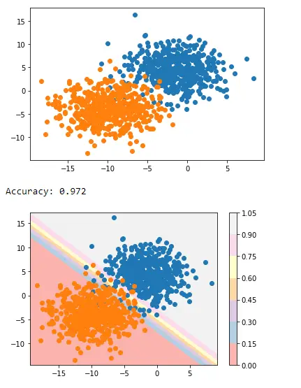
这就是我们如何使用 Matplotlib 的 pyplot 应用决策边界来分隔两个类。
相关文章
Pandas DataFrame DataFrame.shift() 函数
发布时间:2024/04/24 浏览次数:133 分类:Python
-
DataFrame.shift() 函数是将 DataFrame 的索引按指定的周期数进行移位。
Python pandas.pivot_table() 函数
发布时间:2024/04/24 浏览次数:82 分类:Python
-
Python Pandas pivot_table()函数通过对数据进行汇总,避免了数据的重复。
Pandas read_csv()函数
发布时间:2024/04/24 浏览次数:254 分类:Python
-
Pandas read_csv()函数将指定的逗号分隔值(csv)文件读取到 DataFrame 中。
Pandas 多列合并
发布时间:2024/04/24 浏览次数:628 分类:Python
-
本教程介绍了如何在 Pandas 中使用 DataFrame.merge()方法合并两个 DataFrames。
Pandas loc vs iloc
发布时间:2024/04/24 浏览次数:837 分类:Python
-
本教程介绍了如何使用 Python 中的 loc 和 iloc 从 Pandas DataFrame 中过滤数据。
在 Python 中将 Pandas 系列的日期时间转换为字符串
发布时间:2024/04/24 浏览次数:894 分类:Python
-
了解如何在 Python 中将 Pandas 系列日期时间转换为字符串