Changing the color of SVG elements in HTML using CSS
This simple guide is all about using SVG in an HTML document and how we can customize it to change its color using CSS properties. First, we will take a brief look at SVG in HTML.
Introduction to SVG
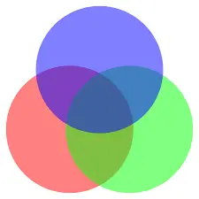
Similar to XHTML, SVG is an XML language that can be used to create vector graphics like the one shown below. It can be used to make images by drawing all the necessary lines and shapes, editing pre-existing raster images, or both.
An image and its elements can be completely altered through filtering, compositing, or other techniques.
After several competing formats were submitted to the W3C but failed to gain full approval, SVG was created in 1999. All popular browsers support SVG.
One disadvantage is that SVG loads slowly. SVG has advantages, including the availability of DOM interfaces and the fact that no third-party extensions are required.
Advantages of using SVG
- Any text editor can be used to create and edit SVG images.
- SVG images can be scripted, compressed, indexed, and searched.
- Images in SVG are scalable.
- High-quality prints of SVG images can be produced at any resolution.
- SVG images can be enlarged.
- If you scale SVG graphics up or down, they retain all of their quality.
- SVG files are pure XML, an open standard.
The SVG Method
SVG is used as a container to hold different graphics. Therefore, it provides a variety of methods or tags to create images on the HTML document itself. This article will discuss some of the elements and the different options available to them.
Drawing a circle using SVG
<circle>A simple circle is drawn in SVG
using the <div> tag. It has different attributes to set the properties of the circle.
As our first example, we will start by drawing a circle using SVG in HTML. The following HTML code draws a circle in SVG.
<!DOCTYPE html>
<html>
<body>

<h1>First SVG Demo</h1>

<svg width="150" height="150">
   <circle cx="60" cy="60" r="50" stroke="red" stroke-width="5" fill="yellow" />
   Sorry, SVG is not supported for your browser.
</svg>
</body>
</html>
The code is presented below.
-
<svg>The element introduces an SVG image. -
<svg>The width and height attributes of the element specify the dimensions of the SVG image. -
A circle can be drawn using
<circle>the element. - The x and y coordinates of the center of the circle are specified by the cx and cy attributes.
- If cx and cy are not set, the center of the circle is set to (0,0).
- The r attribute specifies the radius of the circle.
- The appearance of a shape's outline is controlled by its stroke and stroke-width properties. We give the circle's outline a 5 px red "border".
- The fill attribute refers to the interior color of the circle.
-
Finally, the closing
</svg>tag closes the SVG image.
If your browser does not support SVG, the message "Sorry, your browser does not support SVG" will be displayed.
Drawing a rectangle using SVG
The SVG <rect>element is used to draw a rectangle. Similar to <circle>the element, it has multiple attributes that can be used to set the properties of the rectangle.
The following code snippet draws a rectangle using SVG.
<!DOCTYPE html>
<html>
<body>

<h1>SVG Rectangle</h1>

<svg width="200" height="200">
   <rect width="200" height="100" style="fill:red;stroke-width:5;stroke:black" />
   Sorry, SVG is not supported for your browser.
</svg>
</body>
</html>
- The width and height of the rectangle are determined by the width and height attributes of the rect element.
- The style attribute defines the CSS properties of the rectangle.
- The CSS fill property determines the fill color of the rectangle.
- The CSS stroke-width property determines the width of the rectangle's border.
- The CSS stroke property specifies the border color of a rectangle.
SVG ![]() Tags
Tags
The images contained in an SVG document <image>are represented by the SVG element. It can display either an SVG file or a raster image file.
JPEG, PNG, and other SVG files are the only image formats that SVG software is required to support. The behavior of animated GIFs is undefined.
Below are <image>some properties that need to be set for the tag.
- x: Defines the horizontal position of the image relative to the origin.
- y: Defines the vertical position of the image relative to the origin.
-
width: The dimensions of the rendered image. Unlike the tag in HTML
<img>, this attribute is required. -
height: The rendered height of the image. Unlike the tag in HTML
<img>, this attribute is required. - xlink and href: define the URL of the image file.
- preserveAspectRatio: Manages the scaling of the image.
The following code snippet displays an SVG file using the image tag in SVG.
<!DOCTYPE html>
<html>
<body>

<svg width="96" height="96">
  <image xlink:href="/img/jiyik/logo.svg" width="96" height="96" />
</svg>
</body>
</html>
Changing the color of an SVG image using CSS
If you need to change the color of an SVG image, we can use CSS filter properties to apply different filters to the photo and change its tone and color. The filter CSS property gives an element a visual effect, such as blur or color shift.
It is common practice to use filters to change the way borders, backgrounds, and images are presented.
For example, if we need to change the color of the image in the previous example, then we can use the following filter properties.
.filter-green{
        filter: invert(58%) sepia(69%) saturate(1276%) hue-rotate(76deg) brightness(110%) contrast(109%);
    }
<!DOCTYPE html>
<html>
<body>

<svg class="filter-green" width="96" height="96">
  <image xlink:href="/img/jiyik/logo.svg" width="96" height="96" />
</svg>
</body>
</html>
This will create an overlay effect on the image and change its color. In the above CSS code, we have applied the following filter to the image.
- invert : Inverts the colors of the image. From 0% to 100%, where 100% will completely invert the image.
- sepia : This adds a vintage effect to the image, ultimately changing its color to metallic.
- saturate : Sets the intensity of colors in the image. Higher values mean the colors of the image are more intense and sharper.
- hue-rotate : This changes the hue of the image around the image color wheel.
- brightness : Sets the brightness of the image. A value of 0 means completely black, and 100% means the original brightness of the image. Values greater than 100 will make it brighter.
- contrast : Sets the contrast of the image. A value of 0 means completely black, 100% means the original contrast of the image, and a value greater than 100 makes the contrast higher.
For reprinting, please send an email to 1244347461@qq.com for approval. After obtaining the author's consent, kindly include the source as a link.
Related Articles
Overriding Bootstrap CSS
Publish Date:2025/04/19 Views:80 Category:CSS
-
This article introduces the famous CSS UI framework Bootstrap. We will discuss the process of overriding Bootstrap CSS with custom styles. Bootstrap Overview Using Bootstrap CSS makes it quicker and easier to create responsive websites than
Applying multiple transformations in CSS
Publish Date:2025/04/19 Views:143 Category:CSS
-
CSS transforms are a powerful but underutilized way to add animation effects to elements. However, it can be tricky to get the desired results when applying multiple transformations at once; for example, we want elements to transform in syn
Styling input and submit buttons using CSS
Publish Date:2025/04/19 Views:193 Category:CSS
-
A submit button is a button used to submit data into a form. It is usually placed at the end of the form after all other fields are filled in. When you click the submit button, the form is transferred to the server for processing. The synta
Creating background image gradients using CSS
Publish Date:2025/04/19 Views:164 Category:CSS
-
A background image gradient is a gradual transition from one color to another. Background image gradients can be created using multiple colors, but they are usually most effective when using a limited color palette. This article will teach
Stretchable background images using CSS
Publish Date:2025/04/19 Views:82 Category:CSS
-
This short article is about styling HTML pages using CSS, focusing on styling background images of any HTML element. CSS styles on the web page There are a number of ways to use CSS on your web pages: Inline CSS: Inline CSS means that you u
Gradient backgrounds in CSS
Publish Date:2025/04/19 Views:148 Category:CSS
-
This simple guide is about the use of CSS properties that can be used to define a rainbow-like gradient background for an HTML element. CSS Gradients We can use CSS gradients to display a seamless transition between two or more specified co
First Of Class in CSS
Publish Date:2025/04/19 Views:158 Category:CSS
-
CSS :first-of-type selectors are used to select the first element of its type within a group of elements. For example, if you have a group of paragraphs, :first-of-type the selector will select the first paragraph in the group. This selecto
Bringing an element to the front using CSS
Publish Date:2025/04/19 Views:111 Category:CSS
-
If an element is not set to cover the entire display area, you can z-index bring it to the front using the property. z-index The property determines the stacking order of elements on the page. z-index The higher element is stacked z-index o
Rotating text using CSS
Publish Date:2025/04/19 Views:152 Category:CSS
-
In this article, we will use CSS to rotate HTML text. Rotated text is commonly used in many languages, such as Chinese, Japanese, or Korean. Moreover, when designing a web page, developers may need to rotate the text to a certain degree to